Willow
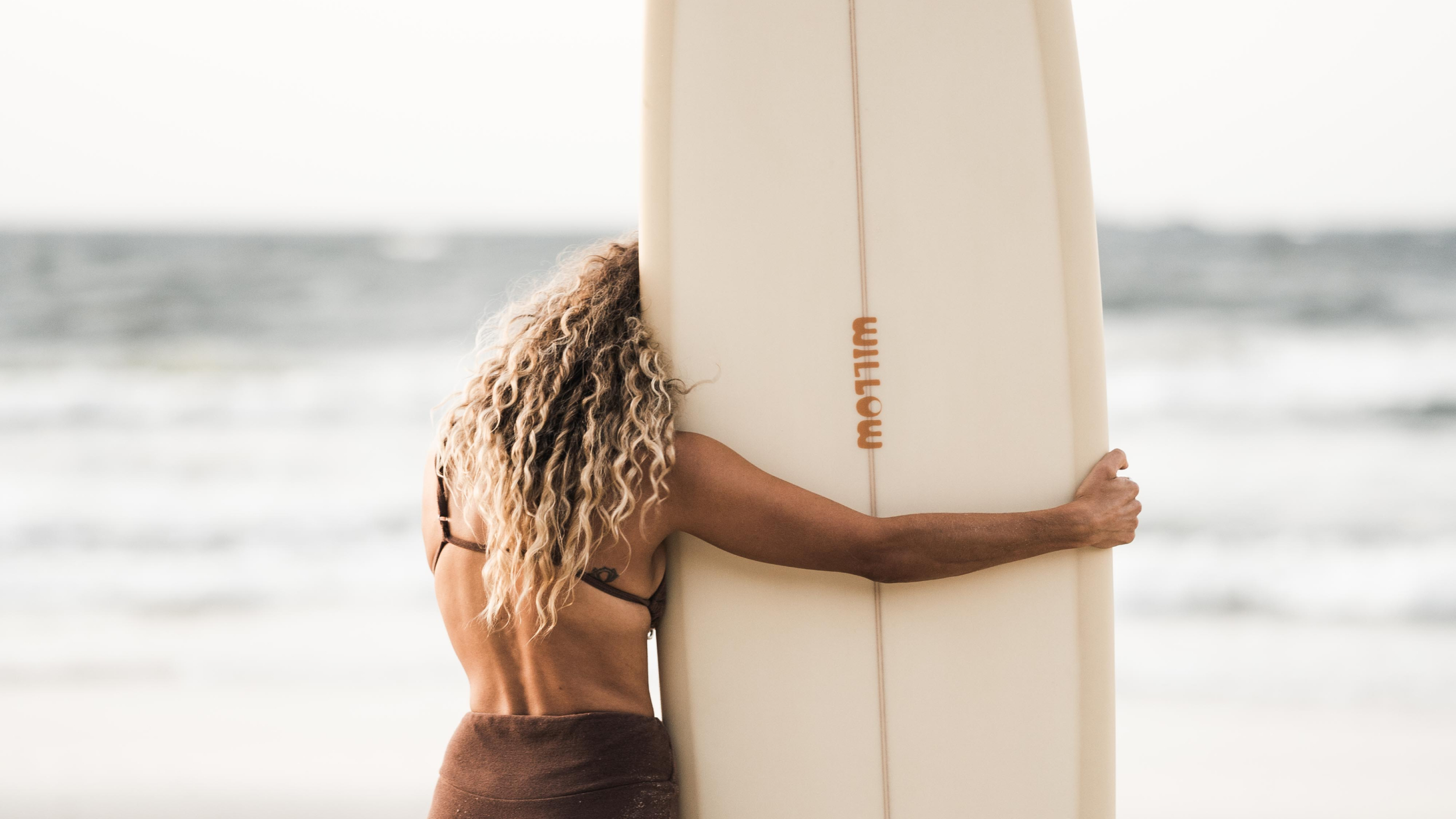
A surf brand made for women.
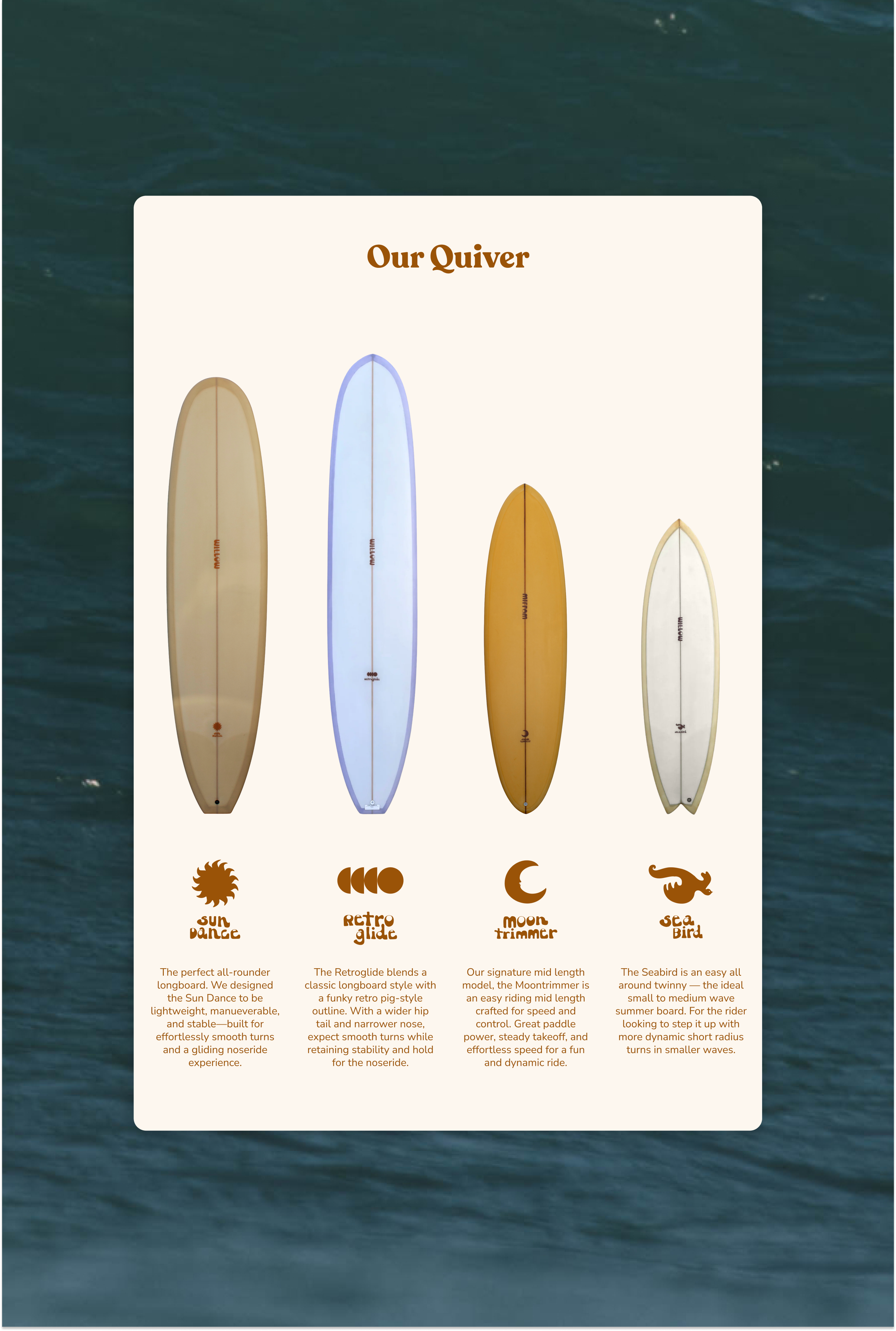
Dean Shoppee, owner of Byron Bay's Surfection, had a clear vision: a surf brand built specifically for women, called Willow. The brief was to bring Willow to life through a strategy and visual identity that spoke directly to women surfers, alongside four core surfboard models designed with women's bodies in mind.
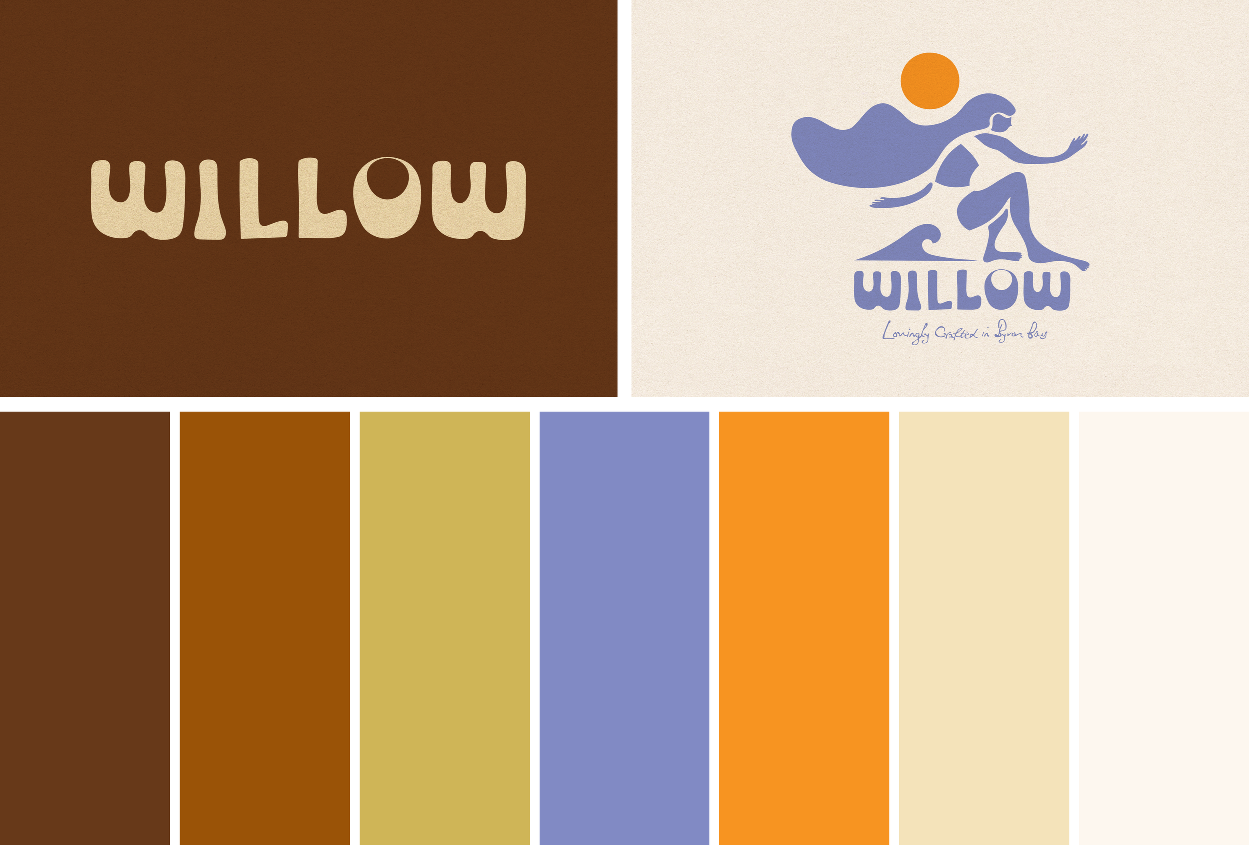
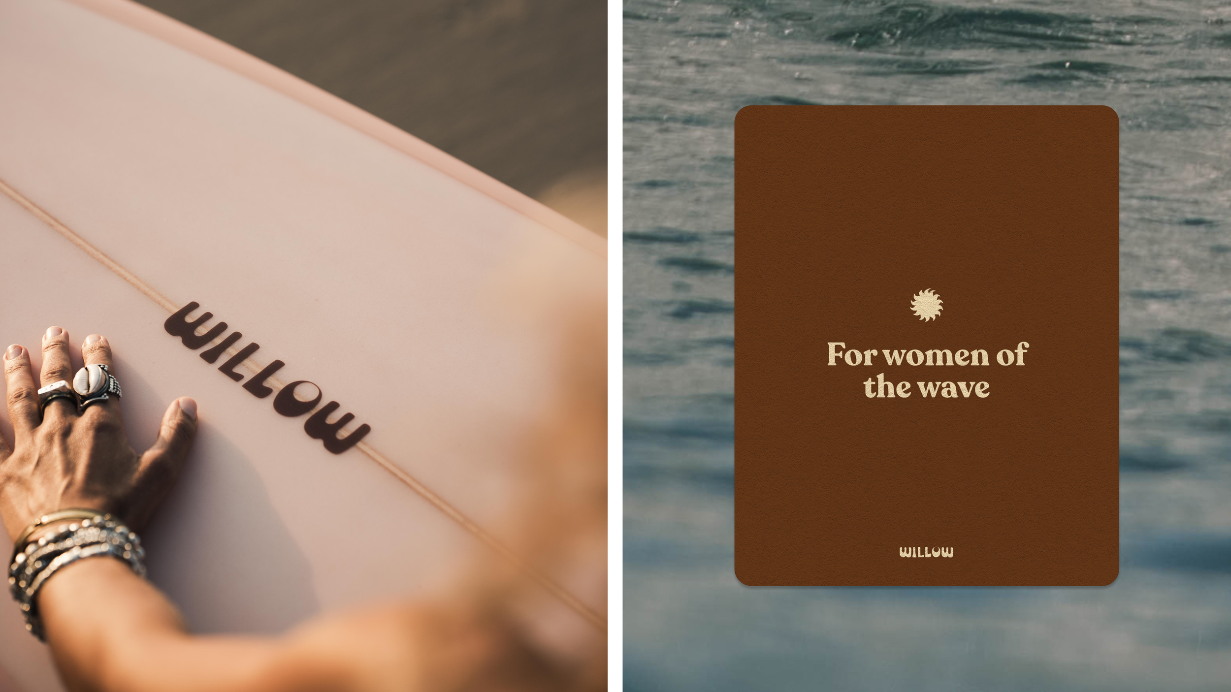
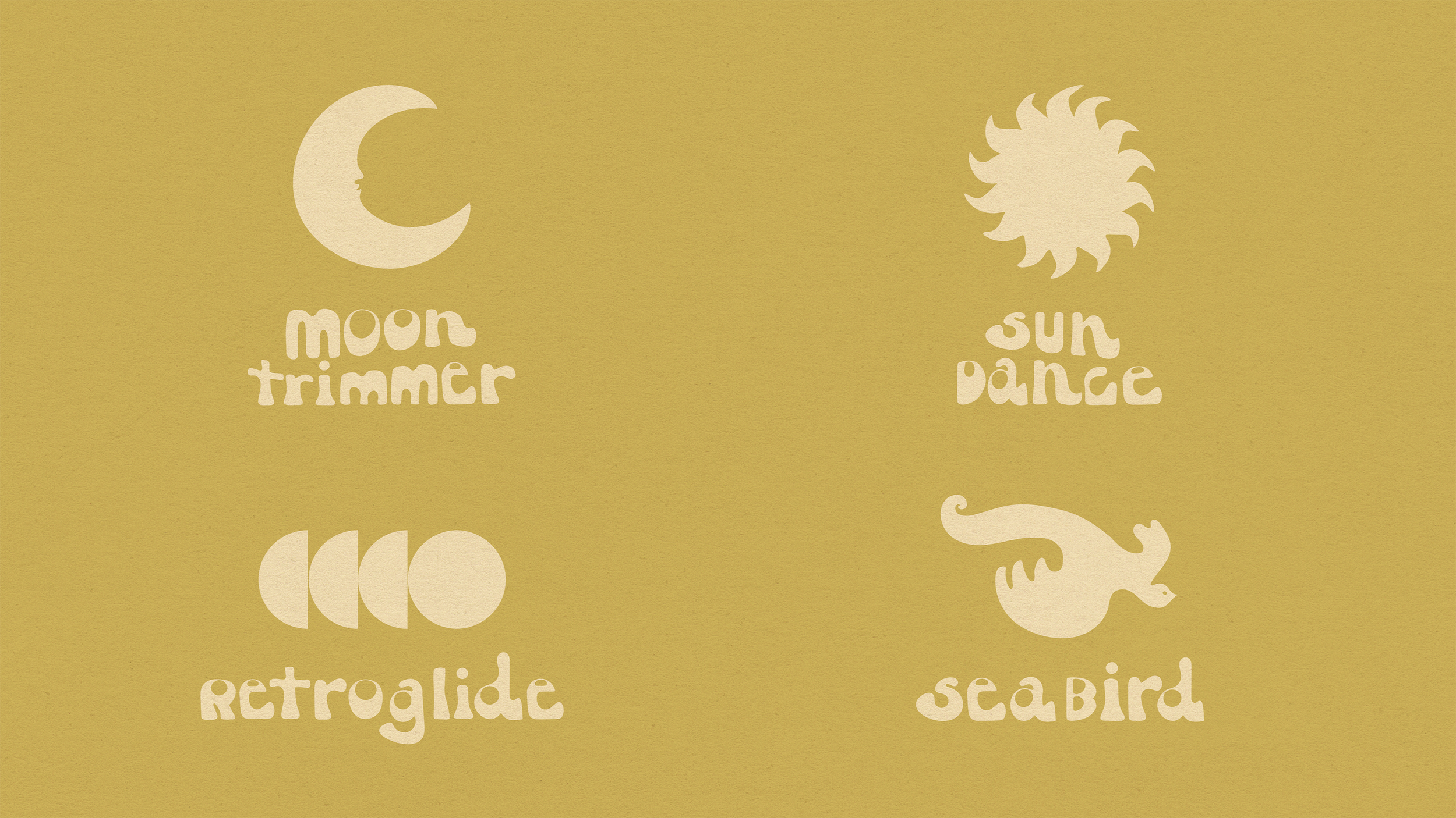
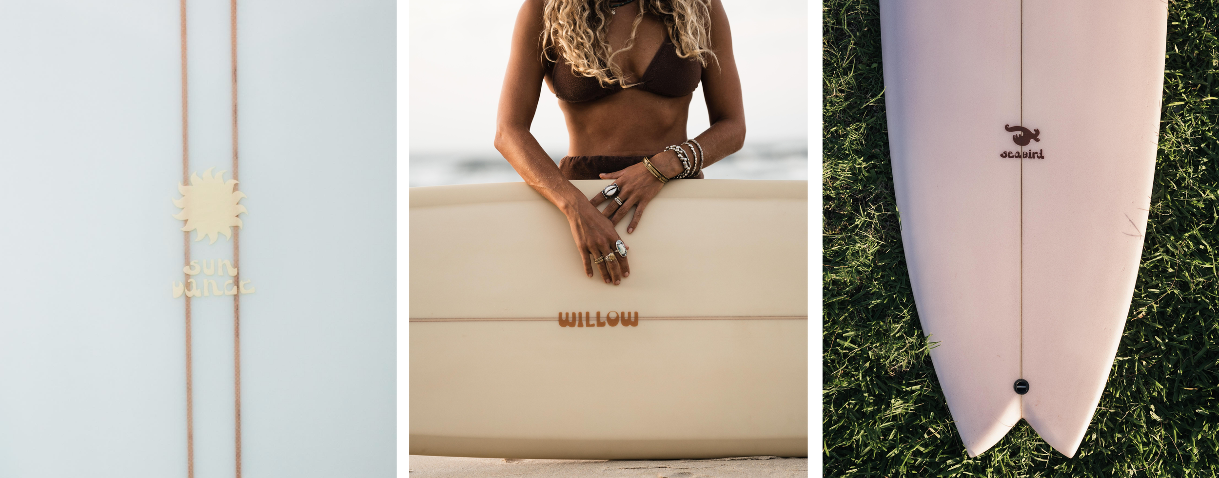
Working closely with the Surfection team, I created a brand strategy and positioning that was about more than helping women surf better. It was about joy and belonging — the feeling of finding your people and your place in the water. This idea of "your surf tribe" became Willow's character: warm, down-to-earth, and always down for a good time. To match that character, I built a colour palette of warm browns, retro colour pops and creams that felt soft, sun-baked, and earthy, with just enough brightness to keep it fun. I wrote the tagline "For women of the wave" and directed the logo and board iconography with designer Madeline O'Donoghue. I also supported the product strategy for the four board models, including naming and positioning, shaping each one to meet women at a different stage of their surf journey.
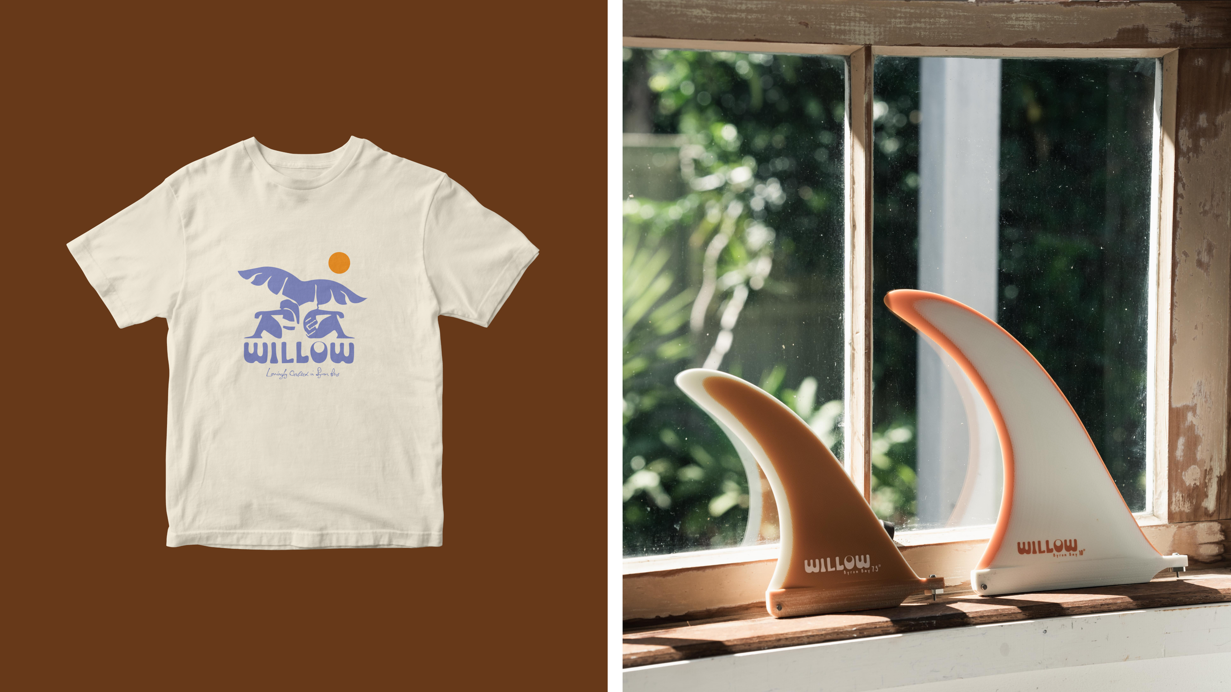
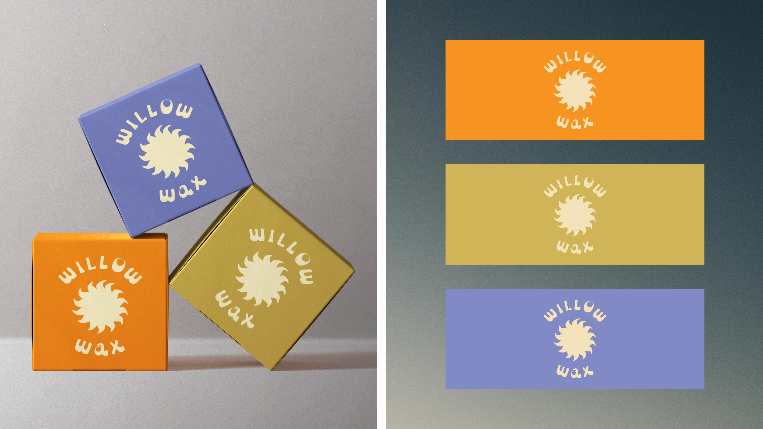
The result: Byron Bay's first women-led surf brand, complete with its own landing page on the Surfection site, four purpose-built boards, in-store signage, and a merch line of tees, fins and wax. The boards can be spotted in the water any day of the week, and Willow's tribe keeps growing.
Collaborators
Scope
Logos, icons & illustrations by Madeline O’Donoghue
In collaboration with Dean Shoppee, Maki Mukaeda, and Surfection Byron Bay
Brand Strategy
Creative Direction
Brand Messaging & Copy